Typeface usage
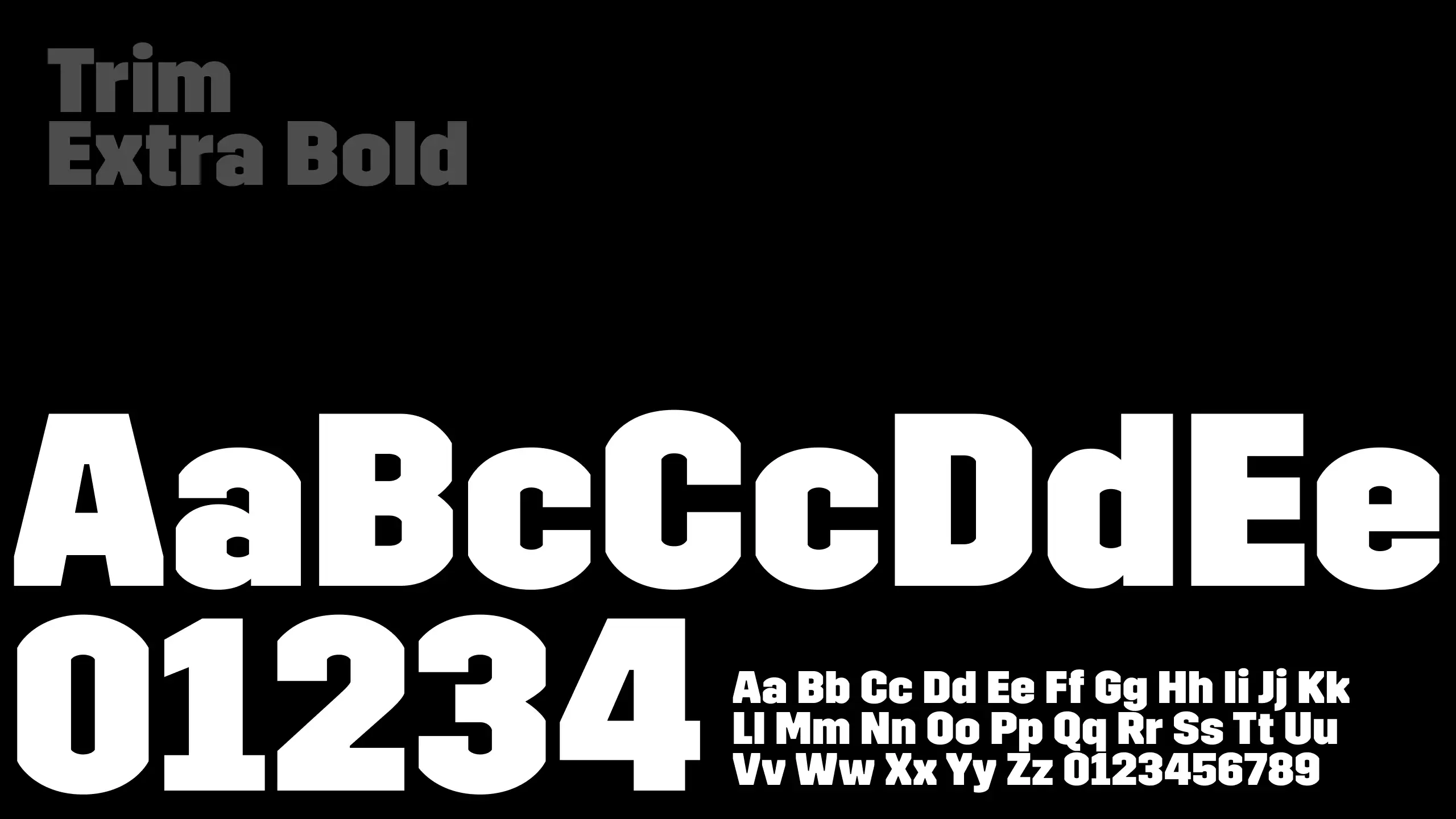
Trim Extra Bold
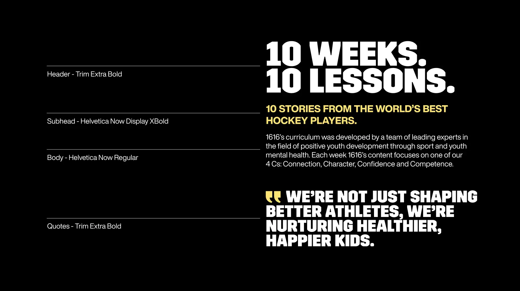
A bold, thick angular sans-serif font reflects the strength, resilience, and determination of young athletes. Its modern and sports inspired feel reinforces 1616’s commitment to building both mental and physical toughness in the next generation. This typeface is to be used for titles, quotes and headers and the recommended weight is extra bold.
Helvetica Now
The clean, modern design reflects 1616’s clarity of purpose and commitment to athlete development. Its timeless, versatile structure balances strength and approachability, reinforcing trust while embodying the precision and discipline essential in both hockey and mental resilience. This typeface is suitable for secondary headlines and body copy.


Typography hierarchy
A clear and consistent type hierarchy ensures readability and reinforces the brand’s voice. Headings should be bold and attention-grabbing, establishing a strong visual structure. Use different weights, sizes, and styles strategically to create emphasis without overwhelming the design. By following this hierarchy, all brand communications will remain cohesive, engaging, and easy to navigate.

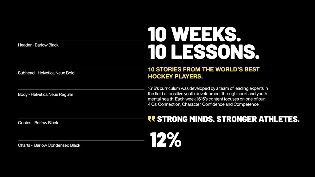
Typography for Google Workspace
When working within Google Docs or Slides—where brand fonts may not be available—maintaining a cohesive look is key. Use approved Google Fonts as close substitutes for our brand typography to ensure consistency across all materials. Always prioritize clarity, hierarchy, and alignment, and keep formatting consistent across documents.
